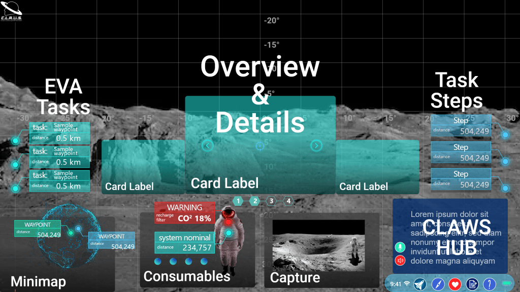
The AR Toolkit for Lunar Astronauts and Scientists (ATLAS) is an information system that was conceived during my time working in a software engineering lab at the University of Michigan.
I led the UX Research, rapid prototyping, and human-in-the-loop testing for an augmented reality information system designed for use in the Artemis generation xEMU spacesuit during lunar EVAs, as well as VEGA (Voice Entity for Guiding Astronauts) a Rasa-based conversational AI.
ATLAS won the 2020 NASA SUITS Challenge, a $10k EPIC MegaGrant, and became the foundational system upon which the CLAWS lab continues to make leading edge technological advances to enable long duration human spaceflight.
A video walkthrough of the AR Design Guide I prepared for the other UX designers and software engineers at CLAWS.
This work was also utilized in the NASA Exploration Habitat (X-Hab) Challenge in collaboration with the Bioastronautics and Life Support Systems Lab at the University of Michigan.
The goal of ATLAS and VEGA are to assist astronauts in cognitively demanding fieldwork. Because of the nature of the work, I guided the UX toward emphasizing non-intrusiveness, adaptivity, and situational awareness.
This project led to:
Further involvement with BLiSS, leading human-centered design to adapt VEGA for NPAS, the NASA Platform for Automated Systems, in collaboration with NASA’s Autonomous Systems Laboratory.
An internship with NASA’s Exploration Medical Capability team where I worked across internal systems as a Human Factors Engineer and UI Architect to advance medical systems for long duration human spaceflight.
My thesis research, which synthesized these experiences to better understand the perception of human-centered design among tech-centered engineers designing systems for human spaceflight and the implications for designing the Future of Work on Earth and in Space.
Finally, my journey at NASA concluded with a tour of the aerospace side on the Convergent Aeronautics Solutions team to deliver human-centered design evangelism in support of advanced urban air mobility (eVTOL, drones, etc.) over the summer prior to entering the PhD program at the University of Michigan School of Information.
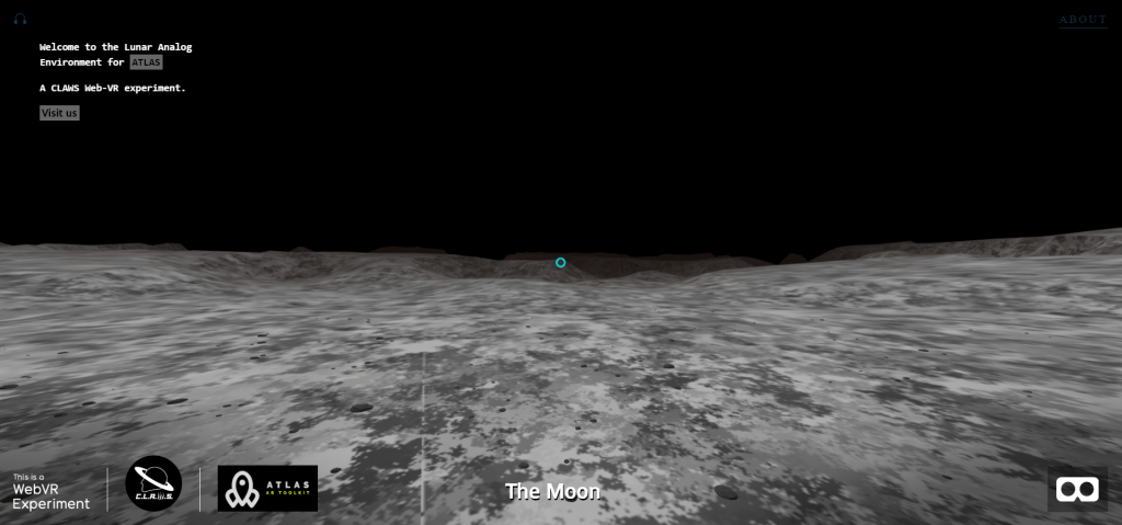
During COVID, I created a test environment in WebVR. This led to my aFrame contributor credit on GitHub!
User experience scorecards are a vital way to communicate usability metrics in a business sense. They allow teams to quantify the user experience and track changes over time.
Collecting consistent and standardized metrics allows organizations to better understand the current user experience of websites, software, and apps (Sauro, 2018).
My most recent round of usability testing was conducted on a prototype for a records management product that has never had user experience research performed. So our priority here was to establish some benchmarks. To do this I tested the prototype against three metrics: success rate, ease of use, and usability. I utilized industry-recognized scoring methods: success criteria scoring (SCS), single ease question (SEQ), and the usability metric for user experience lite (UMUX-lite).
In the case of UMUX-lite, it is common to implement a regression model to transform the scores into a more widely known system usability scale, or SUS score.
Metrics
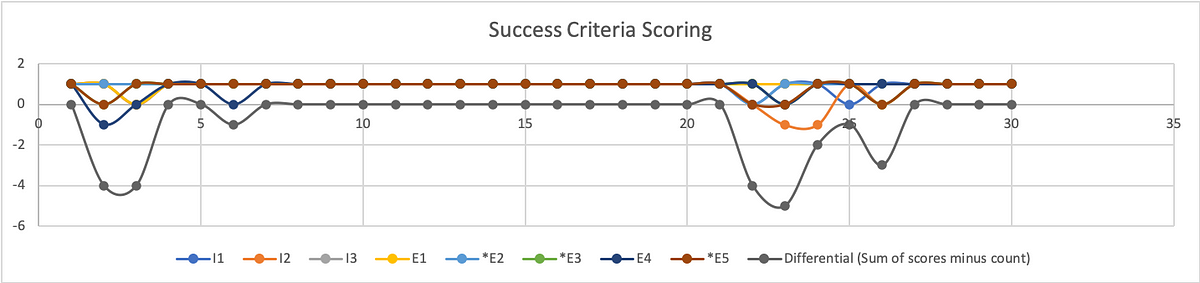
Success Rate
To quantify the success rate, I used success criteria scoring. We broke the test down into a series of steps and scored user performance on each of the steps. Participants could receive 1 of 3 scores. If they completed the step without any issue, they received a 1. If they didn’t need help, but they struggled, they received a 0. If they failed in the attempt or I had to step in to help them, they received a -1.
This test was broken into 31 individual steps. Multiplied by 8 participants, the success criteria scorecard has 248 scoring opportunities.
SCS Differential (Sum minus Count)
Graphic representation of individual SCS scores and aggregated differential.
To better understand where users struggled, we calculate the differential (sum of scores minus count of scores) on a given step.
From the SCS chart above we can see exactly where test participants struggled, and where they had no trouble at all. This chart shows individual results with the differential underneath. As you may note, the best result a participant could receive is a 1, while the best result from the differential is a 0.
To calculate the success rate, we turn to Jakob Nielsen, (2001). Get the sum of your scores. Success (S)= 1; Pass (P) = 0; Fail (F) = -1
Filtering the data by task, our formula for calculating the success rate is:
(S+(P*0.5))/O where O is equivalent to the number of possible scores.
For task 1 the resulting formula looks like: =(25+(6*0.5))/32 = 88%
Because out of 32 scoring opportunities, 25 were successful and 6 were passing.
Of course, participants had no issue with a substantial portion of our prototype. This was a constraint of our test in that our prototype was intended to test the functions and features of a report writing system without actually allowing them to fill out the report. Rather, we simply let them click a form field that would populate data in the relevant fields on that screen, then simply click the button necessary to proceed to the next screen.
The formula for success rate on task 2 is: =(155+(5*0.5))/160 = 98%
Our metrics do reveal an issue related to using the stepper for navigation. The scores participants received during these steps are less indicative of a specific issue and more related to the fact that this is a new UI pattern that participants were unfamiliar with using. Similar to any new UI pattern introduced in the context of software and applications, the feature lacks predictability. Although the feedback from participants and relative scores from the other metrics suggest that the feature is sufficiently easy and usable, we don’t want to express confidence in these findings yet.
As with any new feature or functionality, it is highly recommended that more extensive testing be performed to increase the sample size and generate the kind of statistical significance that we can use to express confidence in our analysis.
The formula for success rate on task 4 is: = (23+(7*0.5))/32 = 83%
Although participants found submitting the report to be the easiest of the tasks. It was only one step. On that single step, half of the participants struggled (scored 0) to find the Done button.
The formula for success rate on task 5 is: =(4+(4*0.5))/8 = 75%
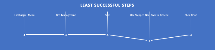
Filtering all the steps for those in which participants had the least success (differential score of -4 to -5), we are left with five specific steps that outline opportunity areas to prioritize improvement for future iterations before release.
The least successful steps according to SCS.
The formula to calculate overall success rate is: =(223+(22*0.5))/248 = 94%
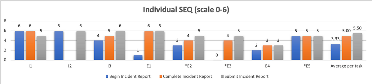
Ease of Use
To quantify ease of use, we opted for the single ease question (SEQ). After 3/5 tasks (Begin incident report, Complete report, Submit report) we asked users on a scale of 0–6, with 0 being very difficult and 6 being very easy, how difficult or easy this task was to complete. Since we have no personal benchmark from previous usability tests with which to compare our scores to, we reference the historical average of 5.5 (Sauro, 2012)
Graphical representation of individual SEQ scores with a combined average.
As we can see from the chart above, our first task scored the worst in terms of ease of use with an average of 3.33. Although participants struggled just as much with completing and submitting the report, they did not view these aspects of the system to be as difficult. Completing a report received an average SEQ score of 5, and submitting the report received the historical average of 5.5.
Usability
You can’t adequately conduct a usability test unless you are testing for usability. There are a variety of industry-recognized usability scoring methods to select from, but the standard is still the System Usability Scale. This is a 10-question survey given after a test and the responses are then aggregated into a SUS score. The average SUS score from years of historical data is 68 (Sauro, 2013).
However, a 10-question survey is a little much to expect good feedback from participants at the end of a usability test. Instead, researchers have developed the Usability Metric for User Experience (UMUX). This is a 5-question survey developed as a more efficient means of generating a similar result. Yet, researchers at IBM went even further, researching the efficacy of the 5-question survey (Lewis, Utesch, & Maher, 2013). What they determined is that they can garner a similar feedback score from simply asking participants to rate their level of agreement with 2 positively framed UMUX statements:
This system’s capabilities meet my requirements.
This system is easy to use.
UMUX-lite 7pt. scale linear regression to SUS
If you ask participants to rate their level of agreement to these two statements on a 7pt scale, with 0 being completely disagreed and 6 being in complete agreement, you can then use a regression formula to transform these scores into a SUS score.
You can find these formulas in the Lewis et al. paper, but I first came across them on Quora, from Otto Ruettinger, Head of Product, Jira Projects at Atlassian (Ruettinger, 2018). In the post, he provided the formulas he uses in Excel to transform raw UMUX-lite scores to serviceable SUS scores.
In its raw format the calculation would be: UMUX-L = ((a. /7) + (b. / 7))/2 x 100
Which gives a range of 14 to 100.
And the SUS regression transform calculation would be:
SUS Score = 0.65 ∗ ((a. + b. − 2) ∗ (100/12))+22.9
Converting 5pt. to 7pt. scale for linear regression to SUS
When I showed my conversions to the other user researcher on my team, she noticed that I was using UMUX-lite on a 5pt. scale, and that my formula would have to be altered from above.
Instead of:
UMUX-L = ((a. /7) + (b. / 7))/2 x 100
it needed to be:
UMUX-L = ((a. /5) + (b. / 5))/2 x 100
As a result, I wasn’t confident in using the SUS regression to generate a SUS score.
Then I found an article on converting Likert scales(IBM Support, 2020). So a 5pt. to a 7pt. scale and vice versa.
What we end up with is: 0=0; 1=2.5; 2=4; 3=5.5; 4=7.
Likert scale transforms 5 to 7pt.
With my scale transformed, I was able to implement the SUS regression formula and obtain the SUS score.
Putting it all together
This is the wonk stuff that nobody but other user researchers likely care about. What your product, dev team, and executives want to see is an “insights forward” summary. You can put this all together in a UX scorecard so that stakeholders can get a quick high-level overview of your analysis concerning your given metrics. These scorecards can help you settle debates, and get the whole team on board by clearly identifying priorities for your next sprint.
Example UX scorecard with grading scales for each metric
Lewis, J. R., Utesch, B. S., & Maher, D. E. (2013). UMUX-LITE — When there’s no time for the SUS. CHI 2013: Changing Perspectives, Paris, France, 2099–2102.
The UX Collective donates US$1 for each article published in our platform. This story contributed to UX Para Minas Pretas (UX For Black Women), a Brazilian organization focused on promoting equity of Black women in the tech industry through initiatives of action, empowerment, and knowledge sharing. Silence against systemic racism is not an option. Build the design community you believe in.
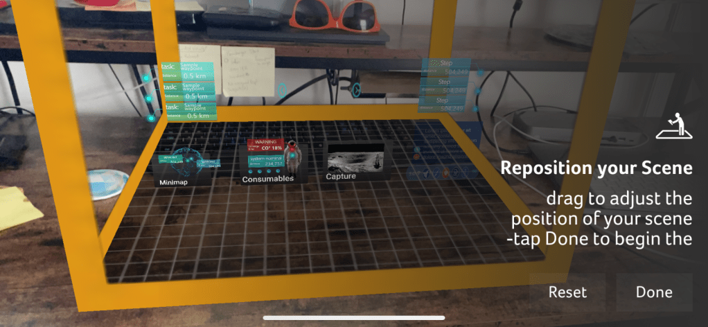
As the resident UX researcher and human in the loop testing co-coordinator for CLAWS, it’s my responsibility to plan, facilitate, and analyze usability tests with real people to get feedback on our AR Toolkit for Lunar Astronauts and Scientists (ATLAS). Earlier this year, CLAWS participated in the NASA SUITS Challenge, the pandemic forced our school to close campus, including our lab. My test plan was scrapped, and although I scrambled to put together a fully interactive prototype that participants could click through on their computer, I wasn’t quite able to complete it in time.
In the coming school year, CLAWS has opted to conduct all collaboration and research activities virtually, including HITL usability testing. Having this pre-plan in place, I’ve begun thinking about how to get the most out of remote testing. First, unlike last year, I am pushing for a more agile and iterative design cycle.
Instead of spending months evaluating our own work before showing it to test participants, I am seeking to test once a month, beginning with a simple paper prototype that we can test remotely with Marvel App. Based on our findings from these tests, we can improve our design. With Marvel, you simply draw your screens out by hand, take photos of them, and then you can link them together with interactive hotspots for test participants to click through.
Initially, I had proposed Adobe XD as a means of putting together an interactive prototype for remote testing and demonstration purposes. With XD, designers have the capability of creating complex prototypes that compliment the modularity ATLAS requires. You can create components, and instead of having to create multiple screens to represent every interaction, you can create every interactive state of that component within the component itself! On top of this, XD allows designers to connect sound files to interactions. Sound files like this one:
PremiumBeat_0013_cursor_click_06.wav
…which could be used to provide audio feedback letting the user know the system has accepted the user’s command.
Depending on how complex we want to get with our prototype, we could even test the implementation of our Voiced Entity for Guiding Astronauts (VEGA), the Jarvis-like AI assistant.
This will be a great way to test ease of use and overall experience before committing the design to code. However, I’ve also begun thinking about the best way to demonstrate our final deliverable to wider audiences. Even if we have a vaccine, it’s likely that a lot of conferences will still be held virtually. Furthermore, this is a big project, with a lot of students working on it, and we should have a final deliverable that showcases our work in an easily accessible format in order to feature it in our portfolio.
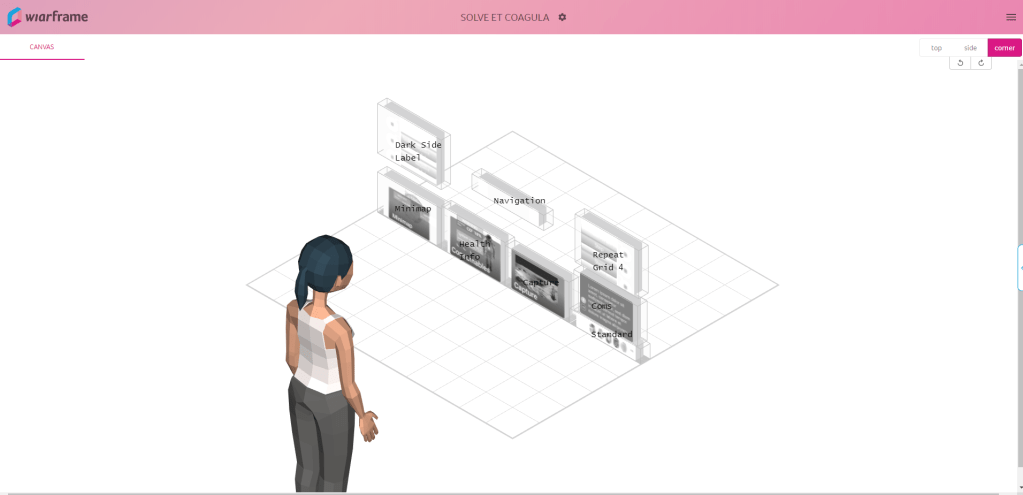
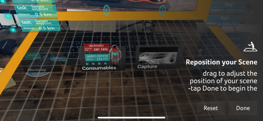
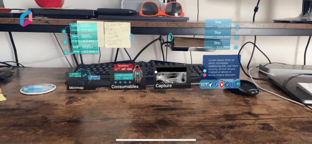
One of the possibilities I’m exploring is wiarframe. This is an app that allows you to set up your AR interface using simple images of your interface components.
The wiarframe design canvas
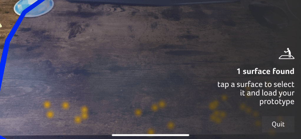
Designers can also prototype a variety of look (gaze, stare) and proximity (approaches, reaches, embraces, retreat) gesture interactions where the component can change state, manipulate other components, even open a URL, call an API, or open another wiarframe interface. This ability to open another wiarframe could enable my team to prototype and link together the individual modules for the user to navigate between.
Wiarframe is really useful when it comes to AR on mobile devices. Less so when the AR is coming from a head mounted display (HMD). Because, to open a wiarframe prototype, users must download the mobile app, and then anchor the interface to a surface.
This is really fun, but there is no sense of immersion. Back at our lab, the BLiSS team created a near life-sized mockup of an ISS airlock with which to immerse test participants in a kind of analog environment. This is common for testing designs for human-computer interaction in space. It is still too costly to test designs on actual users in the context of spaceflight (Holden, Ph.D., Ezer, Ph.D., & Vos, Ph.D., 2013).
In order to get the best feedback out of remote usability testing, we’re going to need an immersive environment, it needs to be cheap and relatively easy to put together, and widely accessible so that we don’t constrain our recruiting pool such that we can’t find participants with the appropriate equipment to test with.
I believe these requirements can be met and our problems solved with A-Frame. A-Frame allows creators to make WebVR with HTML and Javascript, that anybody with a web browser can experience. What’s more, users can fully immerse themselves in the VR environment with a headset like Vive, Rift, Daydream, GearVR.
On top of this, as I was exploring what A-Frame could do through the Showcase examples, I came across a WebVR experiment by NASA, Access Mars. Using A-Frame, users are given the opportunity to explore the real surface of Mars by creating a mesh of images recorded by NASA’s Curiosity rover. Users can actually move around to different areas and learn about Mars by interacting with elements.
An image from Access Mars instructing users on how to interact with it.
New to A-frame, I wasn’t really sure where to begin. Luckily Kevin Ngo of Supermedium, who maintains A-Frame, has a lot of his components available on Github. With limited experience, I was able to find a suitable starting environment, and with a few minor changes to the code, I developed an initial lunar environment.
Screenshot of the A-Frame lunar analog environment
I’ll be honest there’s not much to see. Still, I’m excited about how easy it was to put this together. Similar to Access Mars, I’d like to develop this environment a little more so that users can do some basic movement from location to location. If we use this to test the Rock Identification for Geological Evaluation w.LIDAR(?) (RIGEL) interface, some additional environmental variables would have to be implemented to better simulate geological sampling. There are physics models that can be incorporated to support controllers which would allow for a user with one of the VR headsets mentioned above, to be able to manipulate objects with their hands. The downside of this is it would limit who we could recruit as a testing participant.
If nothing else, I want to be able to test with users through their own web browser. Ideally, they’ll be able to share their screen so I can see what they’re looking at, and their webcam so I can see their expression while they’re looking at it. While it’s not the same as actually being on the surface of the Moon, creating analog environments for simulating habitat design are relatively common at NASA (Stuster, 1996; Clancey, 2004; see also: NEEMO and BASALT). A WebVR environment as a lunar analog in which to test AR concepts follows this approach.
For usability scoring, we are using the standard NASA TLX subjective workload assessment as a Qualtrics survey to get feedback ratings on six subscales:
Mental demand
Physical demand
Temporal demand
Performance
Effort
Frustration
But testing aside, I also think WebVR is the best way to showcase our project as a readily accessible and interactive portfolio piece that interviewers could play with simply by clicking a link as we describe our role and what we did on the project. On top of this, with outreach being a core component of the work we do in CLAWS, an WebVR experience is ideal for younger students to experience ATLAS from the comfort and safety of their own home.
References
Clancey, W. J. (2004). Participant Observation of a Mars Surface Habitat Mission. Moffett Field, CA: NASA-Ames Research Center.
Holden, Ph.D., K., Ezer, Ph.D., N., & Vos, Ph.D., G. (2013). Evidence Report: Risk of Inadequate Human-Computer Interaction. Human Research Program: Space Human Factors and Habitability, 1–46.
ser experience research tends to break down into two broad categories, field studies and usability testing. Or, we might refer to this as need assessment and usability evaluation. Either way, heuristic evaluations will fall under the umbrella of usability methods. This method was invented by Nielsen and Molich (1990) and popularized as a means of discount usability evaluation, aimed at software startups that didn’t have the budget for real user research. Today, user research is more common, and usability testing is the gold standard. If you want to maximize your return on investment (ROI) for usability testing, you’ll want to perform a heuristic evaluation first. This article will explain what a heuristic evaluation is, how to do one, the pros and cons of this method, and why you should do it in lieu of usability testing to maximize the return on investment for both.
With that, let us simply define a heuristic as a usability principle or “rule of thumb”. Although when we refer to heuristics in terms of UX (rather than AI) we are talking about usability, a designer could theoretically employ the same process to judge a product’s compliance with the design system.
As an example, let us say you have an app that was designed without a system in place. Now your company is using a system based on Material Design. You go to the Material website and create a list of their guidelines with which to judge your UI’s compliance. Those guidelines can serve as your “heuristics”, at least in terms of the design.
Remember, the heuristics we are talking about in this article are for usability engineering.
Nielsen developed his heuristics in the early ’90s, distilling a list of nearly 300 known usability issues down to 10 overarching principles. And although they are still widely used today, many user researchers are beginning to develop their own heuristics that are more focused on modern technology and the issues related to it. We didn’t have the powerful mobile and smart technology back then that we take for granted today. The computing technology we did have wasn’t widespread and generalized enough for software companies to care about accessibility issues.
Nowadays, we have a variety of heuristic sets to choose from. For information on some of the more popular sets, refer to Norbi Gaal’s article, “Heuristic Analysis in the design process”.
In addition to the sets referenced by Norbi, there are a few other specialized sets worth noting here:
While developing your own heuristics may be encouraged, care must be taken when selecting appropriate principles. This is where prior user research can inform what heuristics are selected. What are their needs, preferences, pain points that you are trying to support and provide solutions to? Furthermore, and perhaps most importantly, you will want to pilot your heuristics in the same fashion as you would pilot your interviews, surveys, and usability tests.
Quiñones et al. (2017), describes a methodology for developing heuristics. This is an eight-step process through which researchers will:
Explore: Perform a literature review.
Experiment: Analyze data from different experiments to collect additional information.
Describe: Select and prioritize the most important topics revealed from 1–2.
Correlate: Match the features of the specific domain with the usability/UX attributes and existing heuristics.
Select: Keep, adapt, create, and eliminate heuristics obtained from 1–4.
Specify: Formally specify the new set of heuristics.
Validate: Validate the heuristics through experimentation in terms of effectiveness and efficiency in evaluating the specific application.
Refine: Refine and improve the new heuristics based on feedback from 7.
As you can imagine, this process isn’t a quick and dirty means of getting feedback, rather it’s an entire project in itself.
The Evaluation Process
A heuristic evaluation is what is referred to as an expert review. As with other expert reviews, a heuristic evaluation is intended to be a quick and dirty method to uncover issues cheaper than usability testing in terms of both time and money. If you’re not going through the process of developing a new set of heuristics as outlined above, the entire HE process should only take about a week, with the actual evaluation taking no more than a day or two. Instead of recruiting users to put your design in front of, you recruit 3–5 evaluators to review your design according to the chosen heuristics.
The heuristic evaluation process
Familiarize — If you have multiple evaluators (as you should!) then you are going to want them to devote some time familiarizing themselves with the heuristics you plan to use to conduct the evaluation. This is particularly crucial if you are also expecting them to validate a new set of heuristics.
Evaluate — There are a few parts to this stage.
1. First, and let’s be clear: Your evaluators do not have intimate knowledge of your product. You should not be recruiting people who make design/implementation decisions on this product.
2. The evaluators got familiar with the heuristics, now let them familiarize themselves with the product. They should spend an hour or two navigating, clicking/tapping buttons, and understanding the basic patterns and flows the user experiences.
3. Heuristic evaluations are typically conducted in two passes. Each pass should be anywhere from 1–3 hours. In the first pass, evaluators holistically interact with the product and note any heuristic violations. In the second pass, evaluators do it all over again. They also retrace their steps and consider if any violations from the first pass are false alarms.
Rate Severity — This step doesn’t have to be done on its own. Often evaluators will rate the severity at the same time they are noting the violation. They may go back on the second pass and change the severity ratings of previously noted violations. A standard rating scale comes from Jakob Nielsen, and looks like:
0: I don’t agree that this is a usability problem at all
1: Cosmetic problem — quick fix or ignore unless there’s time
2: Minor usability problem — low priority
3: Major usability problem — high priority
4: Usability catastrophe — must be fixed before release
Synthesize and Prioritize Findings — At this stage, the evaluation is complete, and the analysis can begin. The evaluators come together and discuss their findings. Evaluators will create an aggregate list of all noted violations, discuss and identify potential false alarms, and agree upon severity scoring. If they are validating new heuristics, this is also the point at which they will be doing so.
Converge on Design Recommendations — Based on a review of the prioritized findings, the evaluators will then brainstorm and converge on recommendations to solve the usability issues uncovered in the heuristic evaluation.
Why 3–5 evaluators
Depending on your particular circumstances and the given experience of the evaluators you have at your disposal, it may be possible to produce significant findings from a single evaluator. However, there are a few reasons for having multiple evaluators. Nielsen found through his own research on the method that single evaluators will only uncover about 35% of the issues present in the system (Nielsen, 1994). Furthermore, different evaluators tend to find different problems. From the curve shown below, Nielsen demonstrates that the optimal number of evaluators is 3–5. While you may uncover some additional issues by adding more than 5 evaluators, depending on how critical and complex the system to be evaluated is, there is a greater likelihood of overlapping issues found with that of other evaluators. In other words, there are diminishing returns in a cost-benefit analysis as shown below.
Source: Nielsen (1994) Curve showing the proportion of usability problems in an interface found by heuristic evaluation using various numbers of evaluators. The curve represents the average of six case studies of heuristic evaluation.Source: Nielsen (1994) Curve showing how many times the benefits are greater than the costs for heuristic evaluation of a sample project using the assumptions discussed in the text. The optimal number of evaluators in this example is four, with benefits that are 62 times greater than the costs.
Evaluators can pinpoint issues early on and determine the impact on overall UX.
You can get feedback without the ethical and practical dimensions and subsequent costs associated with usability testing.
You can combine it with usability testing.
With the appropriate heuristics, evaluators can flag specific issues and help determine optimal solutions.
Cons:
Depending on the evaluator, false alarms (noted issues that aren’t really problems) can diminish the value of the evaluation (Use multiple evaluators!).
Standard heuristics may not be appropriate for your system/product — validating new heuristics can be expensive.
It can be difficult/expensive to find evaluators who are experts in usability and your system’s domain.
The need for multiple evaluators may make it easier and cheaper to stick with usability testing.
It’s ultimately a subjective exercise: findings can be biased to the evaluator and lack proof, recommendations may not be actionable.
Note the pro: “You can combine it with usability testing”. When you’re conducting a usability test, your prototype is your hypothesis. If you implement a heuristic evaluation correctly, you can catch and fix low-hanging fruit in terms of usability issues, thereby refining your hypothesis before you take it to users. Fixing these before testing allows your participants to identify usability issues from the first-person perspective of the persona, rather than recruiting users to find the kinds of issues that you should have caught yourself.
But let’s not forget to take note of the cons. False alarms as a result of issues found by an evaluator can be problematic and diminish the overarching results of the evaluation. This is yet another reason why multiple evaluators are crucial to making your heuristic evaluation worthwhile. False alarms can often be identified and disregarded when evaluators come together to synthesize and prioritize findings.
Conclusion
Heuristic evaluations are a mainstay of usability engineering and user experience research. Though considered a ‘discount’ method, there are a lot of upfront considerations in order to make the most of them. Using heuristic evaluations as a precursor to usability testing can help improve the return on investment for both, as every issue uncovered and solved with heuristics will allow your users to note other issues from their perspective. In sum, you are not your user, neither are your evaluators. Using heuristic evaluations in conjunction with usability testing will iron out a lot of the kinks before you show it to the user. With these issues already solved for, feedback from usability testing can generate deeper insights to really dial in the design, improving the ROI from both the heuristic evaluation and the usability test.
Sources
Bertini, E., Catarci, T., Dix, A., Gabrielli, S., Kimani, S., & Santucci, G. (2009). Appropriating Heuristic Evaluation for Mobile Computing. International Journal of Mobile Human Computer Interaction, 20–41.
Nielsen, J. (1994, 1 1). Guerrilla HCI: Using Discount Usability Engineering to Penetrate the Intimidation Barrier. Retrieved from NN/g Nielsen Norman Group: https://www.nngroup.com/articles/guerrilla-hci/
The UX Collective donates US$1 for each article published in our platform. This story contributed to UX Para Minas Pretas (UX For Black Women), a Brazilian organization focused on promoting equity of Black women in the tech industry through initiatives of action, empowerment, and knowledge sharing. Silence against systemic racism is not an option. Build the design community you believe in.
Initially, I was going to just discuss Spotify and Snapchat as examples of good and bad UX. Then it dawned on me to discuss the game World of Warcraft as an example of both.
The standard UI for the game has a classic feel to it, but is rather clunky and difficult to use in order to play a game with this level of interactive complexity.
However, the game allows for the use of third party addons, or mods, which modify the UI to augment gameplay and overall user experience. I think this is just brilliant. And while mods are increasingly common amongst big online games, I’m not much of a gamer, I’m really just a childhood fan of Lord of the Rings who always wanted to play Dungeons and Dragons but I lived on a farm in the boondocks and couldn’t get a group together.
This actually brings me to another point, in that as a casual player who isn’t a gamer, I just log in from time to time to scratch an itch. As do many other people. People like me would be completely lost without these addons. So in that sense, they really do improve accessibility for us to enjoy the game and even be competitive.
Some examples of this include and addon called GTFO (Get The F*** Out). This addon sounds an alarm whenever I’m standing in fire, or acid or something that causes damage to my character. This happens a lot, and with everything else that is going on at the same time-
many players will just stand there and either die or become a nuisance to the player(s) charged with healing them.
Another downside to the standard UI is navigation. Now I don’t mean navigating through the interface, I mean using the interface to navigate this mind boggling massive digital universe. I say universe because this game takes place on multiple worlds, at different times and different dimensions and is ever expanding.
One of the major components of the gameplay is exploring this universe by completing quests. While the standard UI does provide some tools such as marking the map and listing quest objectives on the side of the screen as a HUD or Heads Up Display, it can leave you confused, wandering around as a ghost trying to find your body. So a player who also is a developer created an app called TomTom that acts as a navigation arrow in the same vein as GPS navigation, pointing the way to your desired destination. You can set your destination by coordinates, CTRL + Right Click on the map, etc. It even tells you how many “yards” you are from your destination and how long it will take to reach it given current speed and direction. It even allows you to save points on the map so that you can navigate back to interesting or important places not otherwise notated.
These are just two examples of literally thousands of addons developed by the players themselves.
While I find the standard UI to be rather lacking and indicative to a poor UX overall, I also think it is brilliant for the control it gives to the user to modify and control their entire interface.
This last example elaborates on my post and demonstrates how players use addons to augment their gameplay. Just for reference, I use just over 100 addons for my basic UI setup, many of which only activate when I am in a certain zone of the game geographically or playing one of the mini games.
World of Warcraft addons can be found on various websites. Among the most popular are Twitch, which bought Curse, and Tukui, home of ElvUI.