At a glance
- Role: Lead design researcher (solo)
- When: Jan-Feb 2024
- Context: The Sightline MVP for EV-charger rebate intake; regulated utility environment; LI/EJ/R3 focus; ADA/WCAG 2.2 compliance goals.
- Stakeholders: Walker-Miller Energy Services (prime) + ICF (platform) + ComEd (client)
- Users: Residential customers and contractors
- Constraints: PII/consent, accessibility compliance, remote-only sessions (desktop), small N for speed.
Problem
Early MVP feedback signaled friction around information scent, navigation, and accessibility; especially when returning to check the application status or when contractors needed to submit multiple applications.
What I did
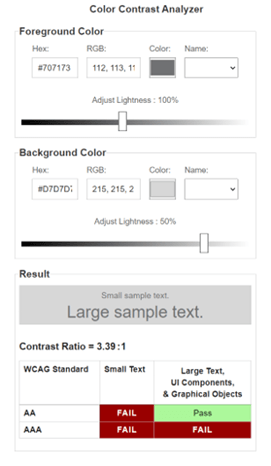
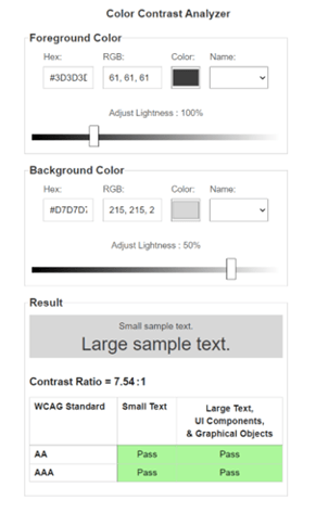
- Audit: Combined WCAG 2.2 (POUR) + Nielsen’s Usability Heuristics, using WAVE/aXe, cognitive walkthroughs, and severity ratings to prioritize issues.
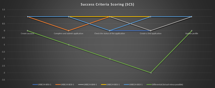
- Usability test (n=5): Remote moderated sessions (Teams) with representative residential users; 5 core tasks; captured Success Criteria Scoring (SCS), Single Ease Question (SEQ), and UX-Lite transformed into System Usability Scale (SUS); think-aloud for qual.
- Rapid Iteration: Partnered with devs to ship a mid-study fix and measured its effect immediately.
Key Insights
Information scent gaps created avoidable friction
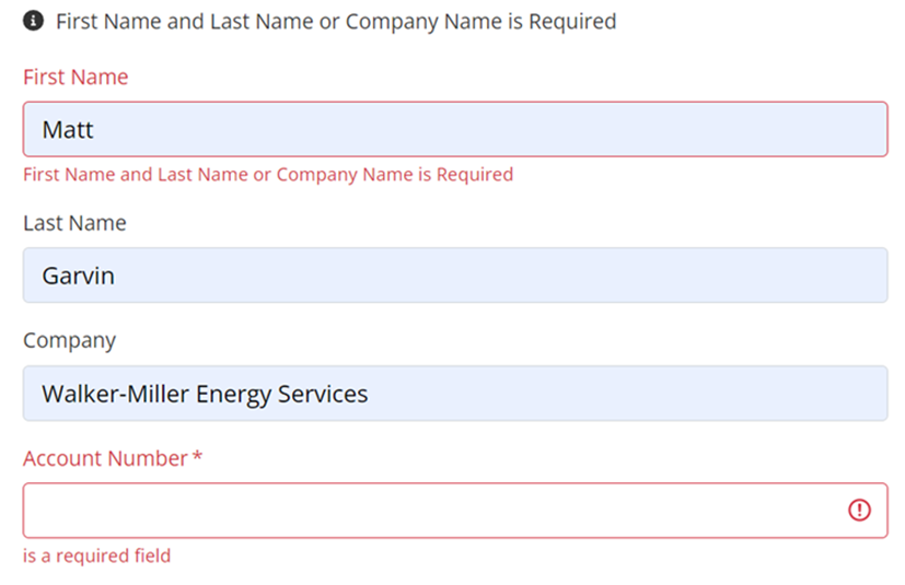
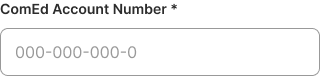
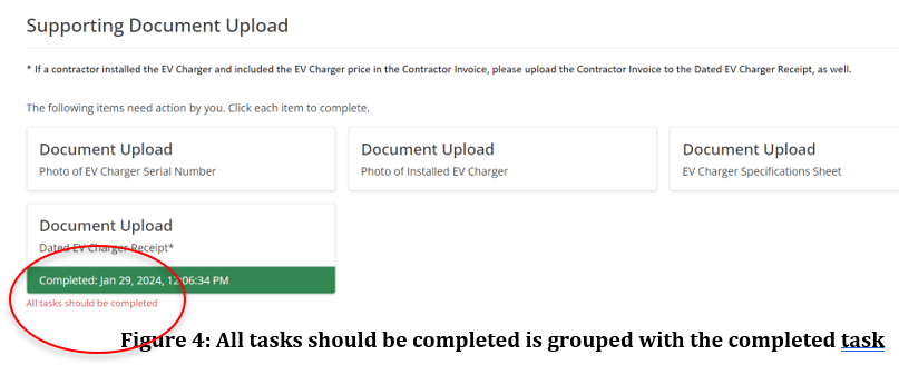
Users hesitated on “Account Number” (ComEd vs. newly created account), and didn’t know acceptable file formats. Inconsistent use of asterisks obscured what was really “required”.
Recommendation: Clarify labels (“ComEd Account Number”), include format examples/validation, list accepted file types, and use asterisks consistently.
Account Number
File Formats
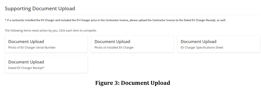
Error Labeling
Error Recovery (mobile) Before and After
On mobile, there was no indication why Create Application failed, and no path to resolution offered. I suggested informational cues for error handling.


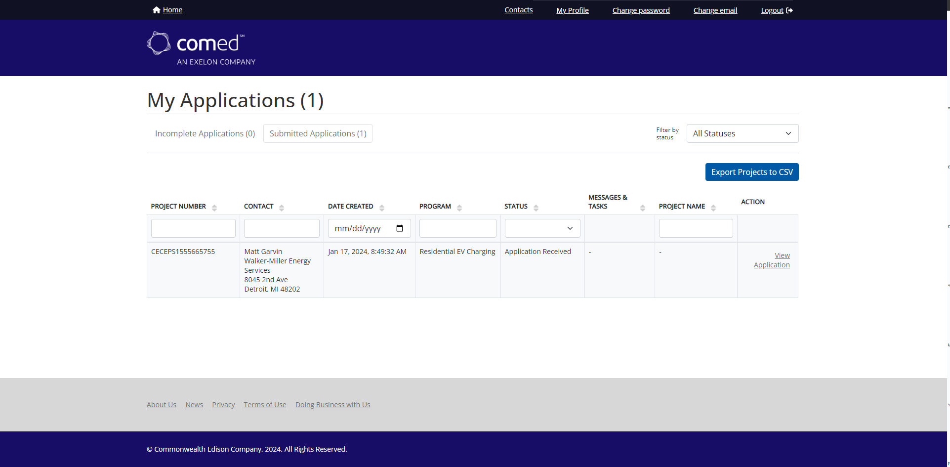
Status-check flow broke expectations
Returning users landed on a blank application instead of Home. This caused confusion and wasted clicks. The brand logo acted as an external link taking users out of the experience.
Recommendation: Route returning users to Home and reserve “Create new application” for contractor personas.
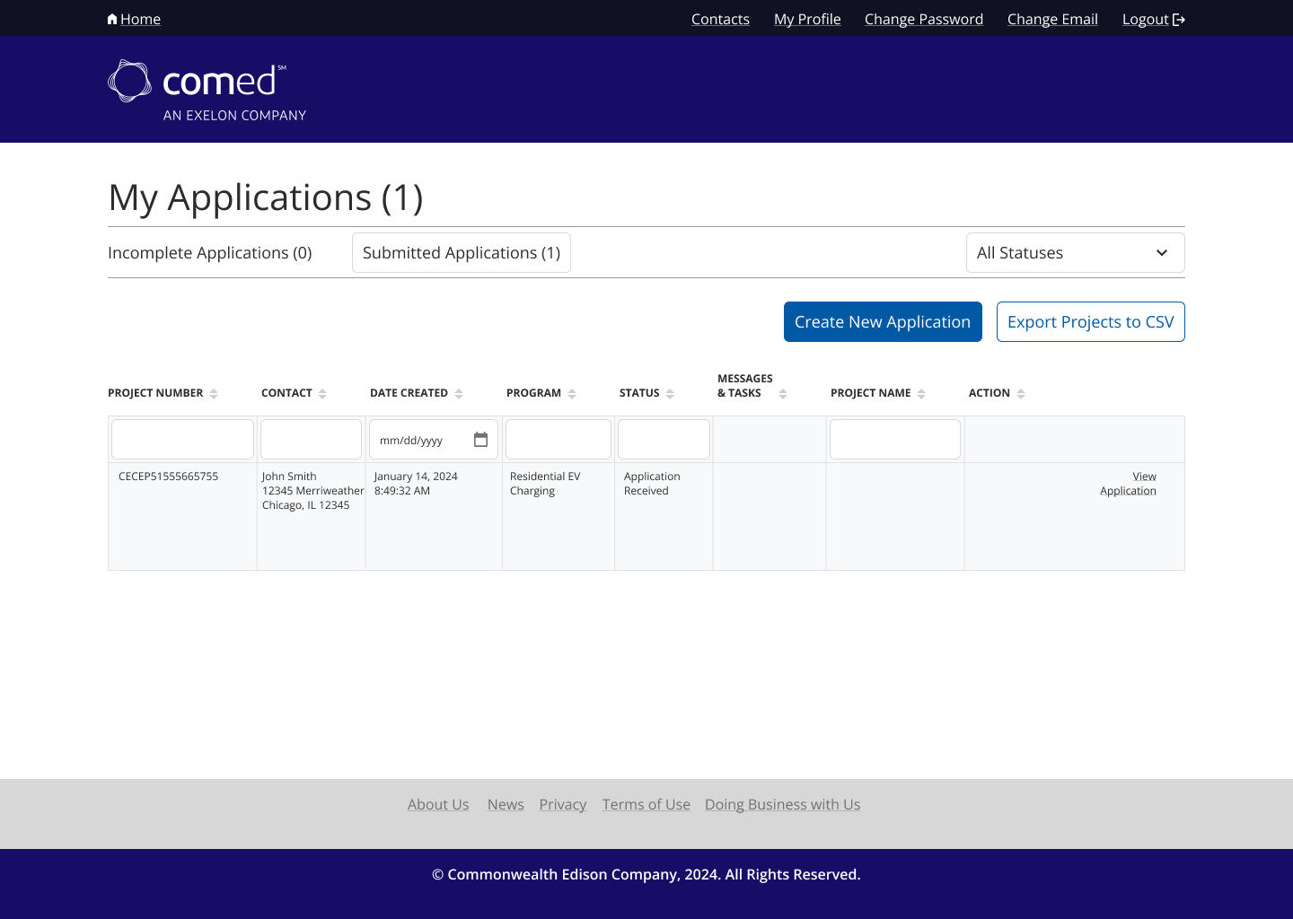
Contractor multi-application workflow was hidden
Recommendation: Add a visible “Create New Application” CTA on Home for contractors (implemented mid-study).
Before and After
Accessibility/Interaction issues
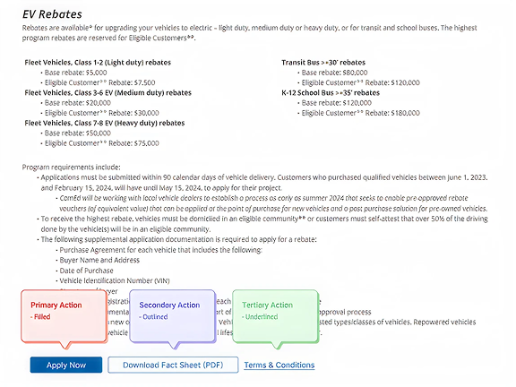
Primary CTAs competed with each other. There was no visual hierarchy. The Next button advanced users to the bottom of the next page (loss of context), and domain terms (e.g., “prevailing wage”) lacked inline help.
Recommendations: Primary/Secondary/Tertiary button styles. Scroll to top on page advance. Provide users with inline definitions and make use of tooltips.
Outcomes
We documented an immediate behavior change after adding “Create New Application” on Home, participants 4-5 completed the contractor task with no issues, versus consistent struggling for participants 1-3.
Usability scores:
SCS:
- SUS: 73.82 (above the 68 average benchmark)
- SEQ (ease 7-pt): Task 3 (status check) 4.9; Task 4 (create 2nd app) 5.2; both highlighted where design changes would yield ROI.
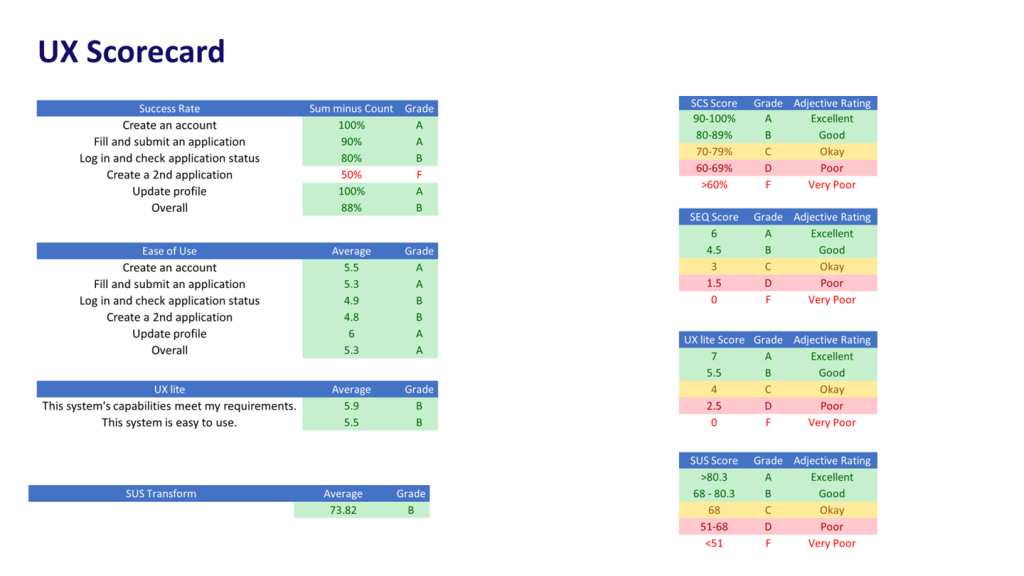
Risk and compliance posture: Heuristic/POUR findings informed fixes for headings hierarchy, step navigation, and color contrast, reducing ADA exposure while aiding screen-reader flows.