Tag: UX

  • UX scorecards: Quantifying and communicating the user experience

    A ruler with one end leaning on an orange block with a yellow background.
    Photo by Markus Spiske on Unsplash

    User experience scorecards are a vital way to communicate usability metrics in a business sense. They allow teams to quantify the user experience and track changes over time.

    Collecting consistent and standardized metrics allows organizations to better understand the current user experience of websites, software, and apps (Sauro, 2018).

    My most recent round of usability testing was conducted on a prototype for a records management product that has never had user experience research performed. So our priority here was to establish some benchmarks. To do this I tested the prototype against three metrics: success rate, ease of use, and usability. I utilized industry-recognized scoring methods: success criteria scoring (SCS), single ease question (SEQ), and the usability metric for user experience lite (UMUX-lite).

    In the case of UMUX-lite, it is common to implement a regression model to transform the scores into a more widely known system usability scale, or SUS score.

    Metrics

    Success Rate

    To quantify the success rate, I used success criteria scoring. We broke the test down into a series of steps and scored user performance on each of the steps. Participants could receive 1 of 3 scores. If they completed the step without any issue, they received a 1. If they didn’t need help, but they struggled, they received a 0. If they failed in the attempt or I had to step in to help them, they received a -1.

    This test was broken into 31 individual steps. Multiplied by 8 participants, the success criteria scorecard has 248 scoring opportunities.

    SCS Differential (Sum minus Count)

    A line graph charting individual participant success rates.
    Graphic representation of individual SCS scores and aggregated differential.

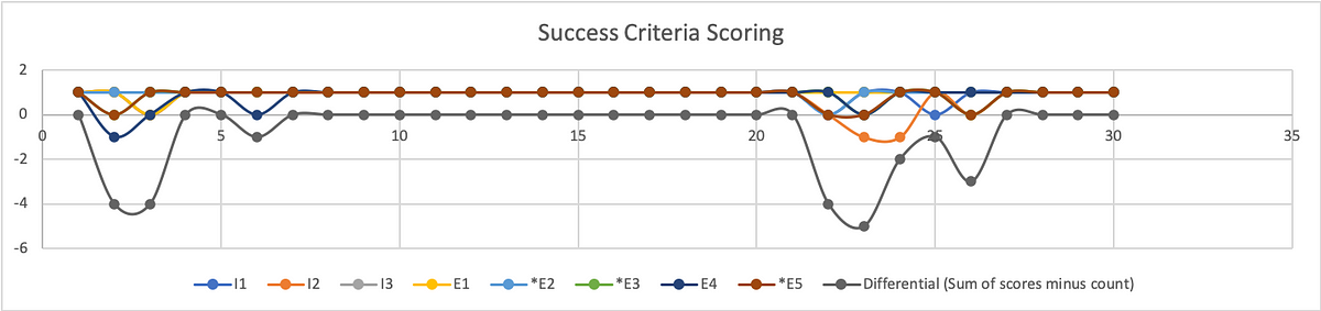
    To better understand where users struggled, we calculate the differential (sum of scores minus count of scores) on a given step.

    From the SCS chart above we can see exactly where test participants struggled, and where they had no trouble at all. This chart shows individual results with the differential underneath. As you may note, the best result a participant could receive is a 1, while the best result from the differential is a 0.

    Broken Down by Task

    A man in a light blue shirt leaning against a corner. The walls and the man are covered in post-it notes.
    Photo by Luis Villasmil on Unsplash

    To calculate the success rate, we turn to Jakob Nielsen, (2001). Get the sum of your scores. Success (S)= 1; Pass (P) = 0; Fail (F) = -1

    Filtering the data by task, our formula for calculating the success rate is:

    (S+(P*0.5))/O where O is equivalent to the number of possible scores.

    For task 1 the resulting formula looks like: =(25+(6*0.5))/32 = 88%

    Because out of 32 scoring opportunities, 25 were successful and 6 were passing.

    Of course, participants had no issue with a substantial portion of our prototype. This was a constraint of our test in that our prototype was intended to test the functions and features of a report writing system without actually allowing them to fill out the report. Rather, we simply let them click a form field that would populate data in the relevant fields on that screen, then simply click the button necessary to proceed to the next screen.

    The formula for success rate on task 2 is: =(155+(5*0.5))/160 = 98%

    Our metrics do reveal an issue related to using the stepper for navigation. The scores participants received during these steps are less indicative of a specific issue and more related to the fact that this is a new UI pattern that participants were unfamiliar with using. Similar to any new UI pattern introduced in the context of software and applications, the feature lacks predictability. Although the feedback from participants and relative scores from the other metrics suggest that the feature is sufficiently easy and usable, we don’t want to express confidence in these findings yet.

    As with any new feature or functionality, it is highly recommended that more extensive testing be performed to increase the sample size and generate the kind of statistical significance that we can use to express confidence in our analysis.

    The formula for success rate on task 4 is: = (23+(7*0.5))/32 = 83%

    Although participants found submitting the report to be the easiest of the tasks. It was only one step. On that single step, half of the participants struggled (scored 0) to find the Done button.

    The formula for success rate on task 5 is: =(4+(4*0.5))/8 = 75%

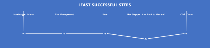
    Filtering all the steps for those in which participants had the least success (differential score of -4 to -5), we are left with five specific steps that outline opportunity areas to prioritize improvement for future iterations before release.

    Chart of the least successful steps. White text on a blue background.
    The least successful steps according to SCS.

    The formula to calculate overall success rate is: =(223+(22*0.5))/248 = 94%

    Ease of Use

    To quantify ease of use, we opted for the single ease question (SEQ). After 3/5 tasks (Begin incident report, Complete report, Submit report) we asked users on a scale of 0–6, with 0 being very difficult and 6 being very easy, how difficult or easy this task was to complete. Since we have no personal benchmark from previous usability tests with which to compare our scores to, we reference the historical average of 5.5 (Sauro, 2012)

    Graphical representation of individual SEQ scores with a combined average.
    Graphical representation of individual SEQ scores with a combined average.

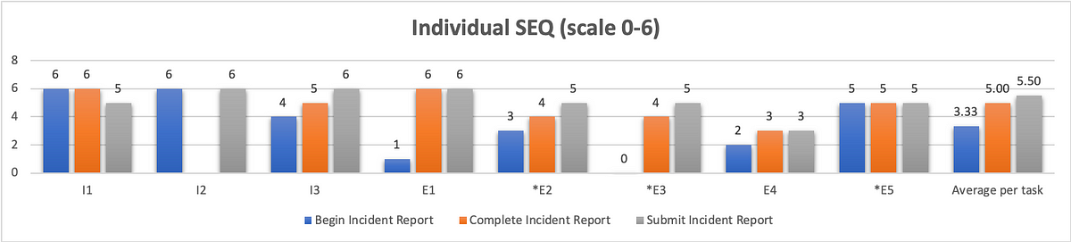
    As we can see from the chart above, our first task scored the worst in terms of ease of use with an average of 3.33. Although participants struggled just as much with completing and submitting the report, they did not view these aspects of the system to be as difficult. Completing a report received an average SEQ score of 5, and submitting the report received the historical average of 5.5.

    Usability

    You can’t adequately conduct a usability test unless you are testing for usability. There are a variety of industry-recognized usability scoring methods to select from, but the standard is still the System Usability Scale. This is a 10-question survey given after a test and the responses are then aggregated into a SUS score. The average SUS score from years of historical data is 68 (Sauro, 2013).

    However, a 10-question survey is a little much to expect good feedback from participants at the end of a usability test. Instead, researchers have developed the Usability Metric for User Experience (UMUX). This is a 5-question survey developed as a more efficient means of generating a similar result. Yet, researchers at IBM went even further, researching the efficacy of the 5-question survey (Lewis, Utesch, & Maher, 2013). What they determined is that they can garner a similar feedback score from simply asking participants to rate their level of agreement with 2 positively framed UMUX statements:

    This system’s capabilities meet my requirements.

    This system is easy to use.

    UMUX-lite 7pt. scale linear regression to SUS

    If you ask participants to rate their level of agreement to these two statements on a 7pt scale, with 0 being completely disagreed and 6 being in complete agreement, you can then use a regression formula to transform these scores into a SUS score.

    You can find these formulas in the Lewis et al. paper, but I first came across them on Quora, from Otto Ruettinger, Head of Product, Jira Projects at Atlassian (Ruettinger, 2018). In the post, he provided the formulas he uses in Excel to transform raw UMUX-lite scores to serviceable SUS scores.

    In its raw format the calculation would be:
     UMUX-L = ((a. /7) + (b. / 7))/2 x 100

    Which gives a range of 14 to 100.

    And the SUS regression transform calculation would be:

    SUS Score = 0.65 ∗ ((a. + b. − 2) ∗ (100/12))+22.9

    Converting 5pt. to 7pt. scale for linear regression to SUS

    When I showed my conversions to the other user researcher on my team, she noticed that I was using UMUX-lite on a 5pt. scale, and that my formula would have to be altered from above.

    Instead of:

    UMUX-L = ((a. /7) + (b. / 7))/2 x 100

    it needed to be:

    UMUX-L = ((a. /5) + (b. / 5))/2 x 100

    As a result, I wasn’t confident in using the SUS regression to generate a SUS score.

    Then I found an article on converting Likert scales(IBM Support, 2020). So a 5pt. to a 7pt. scale and vice versa.

    What we end up with is: 0=0; 1=2.5; 2=4; 3=5.5; 4=7.

    Small data table showing how to convert 5 point to 7 point scale.
    Likert scale transforms 5 to 7pt.

    With my scale transformed, I was able to implement the SUS regression formula and obtain the SUS score.

    Putting it all together

    This is the wonk stuff that nobody but other user researchers likely care about. What your product, dev team, and executives want to see is an “insights forward” summary. You can put this all together in a UX scorecard so that stakeholders can get a quick high-level overview of your analysis concerning your given metrics. These scorecards can help you settle debates, and get the whole team on board by clearly identifying priorities for your next sprint.

    Graphical example of a UX scorecard with grading scale for the usability metrics on the right side.
    Example UX scorecard with grading scales for each metric

    Works Cited

    IBM Support. (2020, 4 16). Transforming different Likert scales to a common scale. Retrieved from IBM Support: https://www.ibm.com/support/pages/transforming-different-likert-scales-common-scale

    Sauro, J. (2012, 10 30). 10 Things to Know about the Single Ease Question (SEQ). Retrieved from MeasuringU: https://measuringu.com/seq10/

    Sauro, J. (2018, 19 23). Building a UX Metrics Scorecard. Retrieved from MeasuringU: https://measuringu.com/ux-scorecard/

    Lewis, J. R., Utesch, B. S., & Maher, D. E. (2013). UMUX-LITE — When there’s no time for the SUS. CHI 2013: Changing Perspectives, Paris, France, 2099–2102.

    Nielsen, J. (2001, 2 17). Success Rate: The Simplest Usability Metric. Retrieved from NN/g Nielsen Norman Group: https://www.nngroup.com/articles/success-rate-the-simplest-usability-metric/

    Ruettinger, O. (2018, 6 5). How is UMUX-L calculated in your company? Retrieved from Quora: https://www.quora.com/How-is-UMUX-L-calculated-in-your-company

    Sauro, J. (2013, 6 18). 10 Things to Know About the System Usability Scale (SUS). Retrieved from MeasuringU: https://measuringu.com/10-things-sus/

    The UX Collective donates US$1 for each article published in our platform. This story contributed to UX Para Minas Pretas (UX For Black Women), a Brazilian organization focused on promoting equity of Black women in the tech industry through initiatives of action, empowerment, and knowledge sharing. Silence against systemic racism is not an option. Build the design community you believe in.
  • Creating a Lunar Analog Environment in A-Frame

    As the resident UX researcher and human in the loop testing co-coordinator for CLAWS, it’s my responsibility to plan, facilitate, and analyze usability tests with real people to get feedback on our AR Toolkit for Lunar Astronauts and Scientists (ATLAS). Earlier this year, CLAWS participated in the NASA SUITS Challenge, the pandemic forced our school to close campus, including our lab. My test plan was scrapped, and although I scrambled to put together a fully interactive prototype that participants could click through on their computer, I wasn’t quite able to complete it in time.

    In the coming school year, CLAWS has opted to conduct all collaboration and research activities virtually, including HITL usability testing. Having this pre-plan in place, I’ve begun thinking about how to get the most out of remote testing. First, unlike last year, I am pushing for a more agile and iterative design cycle.

    Instead of spending months evaluating our own work before showing it to test participants, I am seeking to test once a month, beginning with a simple paper prototype that we can test remotely with Marvel App. Based on our findings from these tests, we can improve our design. With Marvel, you simply draw your screens out by hand, take photos of them, and then you can link them together with interactive hotspots for test participants to click through.

    Initially, I had proposed Adobe XD as a means of putting together an interactive prototype for remote testing and demonstration purposes. With XD, designers have the capability of creating complex prototypes that compliment the modularity ATLAS requires. You can create components, and instead of having to create multiple screens to represent every interaction, you can create every interactive state of that component within the component itself! On top of this, XD allows designers to connect sound files to interactions. Sound files like this one:

    PremiumBeat_0013_cursor_click_06.wav

    …which could be used to provide audio feedback letting the user know the system has accepted the user’s command.

    Depending on how complex we want to get with our prototype, we could even test the implementation of our Voiced Entity for Guiding Astronauts (VEGA), the Jarvis-like AI assistant.

    This will be a great way to test ease of use and overall experience before committing the design to code. However, I’ve also begun thinking about the best way to demonstrate our final deliverable to wider audiences. Even if we have a vaccine, it’s likely that a lot of conferences will still be held virtually. Furthermore, this is a big project, with a lot of students working on it, and we should have a final deliverable that showcases our work in an easily accessible format in order to feature it in our portfolio.

    One of the possibilities I’m exploring is wiarframe. This is an app that allows you to set up your AR interface using simple images of your interface components.

    The wiarframe design canvas

    Designers can also prototype a variety of look (gaze, stare) and proximity (approaches, reaches, embraces, retreat) gesture interactions where the component can change state, manipulate other components, even open a URL, call an API, or open another wiarframe interface. This ability to open another wiarframe could enable my team to prototype and link together the individual modules for the user to navigate between.

    Wiarframe is really useful when it comes to AR on mobile devices. Less so when the AR is coming from a head mounted display (HMD). Because, to open a wiarframe prototype, users must download the mobile app, and then anchor the interface to a surface.

    This is really fun, but there is no sense of immersion. Back at our lab, the BLiSS team created a near life-sized mockup of an ISS airlock with which to immerse test participants in a kind of analog environment. This is common for testing designs for human-computer interaction in space. It is still too costly to test designs on actual users in the context of spaceflight (Holden, Ph.D., Ezer, Ph.D., & Vos, Ph.D., 2013).

    In order to get the best feedback out of remote usability testing, we’re going to need an immersive environment, it needs to be cheap and relatively easy to put together, and widely accessible so that we don’t constrain our recruiting pool such that we can’t find participants with the appropriate equipment to test with.

    I believe these requirements can be met and our problems solved with A-Frame. A-Frame allows creators to make WebVR with HTML and Javascript, that anybody with a web browser can experience. What’s more, users can fully immerse themselves in the VR environment with a headset like Vive, Rift, Daydream, GearVR.

    On top of this, as I was exploring what A-Frame could do through the Showcase examples, I came across a WebVR experiment by NASA, Access Mars. Using A-Frame, users are given the opportunity to explore the real surface of Mars by creating a mesh of images recorded by NASA’s Curiosity rover. Users can actually move around to different areas and learn about Mars by interacting with elements.

    An image from Access Mars instructing users on how to interact with it.

    New to A-frame, I wasn’t really sure where to begin. Luckily Kevin Ngo of Supermedium, who maintains A-Frame, has a lot of his components available on Github. With limited experience, I was able to find a suitable starting environment, and with a few minor changes to the code, I developed an initial lunar environment.

    Screenshot of the A-Frame lunar analog environment

    If you’d like to look around, follow this link:

    https://mtthwgrvn-aframe-lunar-analog.glitch.me/

    I’ll be honest there’s not much to see. Still, I’m excited about how easy it was to put this together. Similar to Access Mars, I’d like to develop this environment a little more so that users can do some basic movement from location to location. If we use this to test the Rock Identification for Geological Evaluation w.LIDAR(?) (RIGEL) interface, some additional environmental variables would have to be implemented to better simulate geological sampling. There are physics models that can be incorporated to support controllers which would allow for a user with one of the VR headsets mentioned above, to be able to manipulate objects with their hands. The downside of this is it would limit who we could recruit as a testing participant.

    If nothing else, I want to be able to test with users through their own web browser. Ideally, they’ll be able to share their screen so I can see what they’re looking at, and their webcam so I can see their expression while they’re looking at it. While it’s not the same as actually being on the surface of the Moon, creating analog environments for simulating habitat design are relatively common at NASA (Stuster, 1996; Clancey, 2004; see also: NEEMO and BASALT). A WebVR environment as a lunar analog in which to test AR concepts follows this approach.

    For usability scoring, we are using the standard NASA TLX subjective workload assessment as a Qualtrics survey to get feedback ratings on six subscales:

    • Mental demand
    • Physical demand
    • Temporal demand
    • Performance
    • Effort
    • Frustration

    But testing aside, I also think WebVR is the best way to showcase our project as a readily accessible and interactive portfolio piece that interviewers could play with simply by clicking a link as we describe our role and what we did on the project. On top of this, with outreach being a core component of the work we do in CLAWS, an WebVR experience is ideal for younger students to experience ATLAS from the comfort and safety of their own home.

    References

    Clancey, W. J. (2004). Participant Observation of a Mars Surface Habitat Mission. Moffett Field, CA: NASA-Ames Research Center.

    Holden, Ph.D., K., Ezer, Ph.D., N., & Vos, Ph.D., G. (2013). Evidence Report: Risk of Inadequate Human-Computer Interaction. Human Research Program: Space Human Factors and Habitability, 1–46.

  • Use heuristic evaluations prior to usability testing to improve ROI

    Catch low-hanging fruit with heuristics so that users can reveal deeper insights in usability tests

    Photo by Scott Graham on Unsplash

    ser experience research tends to break down into two broad categories, field studies and usability testing. Or, we might refer to this as need assessment and usability evaluation. Either way, heuristic evaluations will fall under the umbrella of usability methods. This method was invented by Nielsen and Molich (1990) and popularized as a means of discount usability evaluation, aimed at software startups that didn’t have the budget for real user research. Today, user research is more common, and usability testing is the gold standard. If you want to maximize your return on investment (ROI) for usability testing, you’ll want to perform a heuristic evaluation first. This article will explain what a heuristic evaluation is, how to do one, the pros and cons of this method, and why you should do it in lieu of usability testing to maximize the return on investment for both.

    In Nielsen’s own words:

    Jakob Nielsen looking thoughtfully into the camera
    Jakob Nielsen

    “Heuristic Evaluation is a usability engineering method for finding the usability problems in a user interface design so that they can be attended to as part of an iterative design process. Heuristic evaluation involves having a small set of evaluators examine the interface and judge its compliance with recognized usability principles (the “heuristics”). ~ Jakob Nielsen,

    Defining ‘heuristic’

    With that, let us simply define a heuristic as a usability principle or “rule of thumb”. Although when we refer to heuristics in terms of UX (rather than AI) we are talking about usability, a designer could theoretically employ the same process to judge a product’s compliance with the design system.

    As an example, let us say you have an app that was designed without a system in place. Now your company is using a system based on Material Design. You go to the Material website and create a list of their guidelines with which to judge your UI’s compliance. Those guidelines can serve as your “heuristics”, at least in terms of the design.

    Remember, the heuristics we are talking about in this article are for usability engineering.

    Nielsen developed his heuristics in the early ’90s, distilling a list of nearly 300 known usability issues down to 10 overarching principles. And although they are still widely used today, many user researchers are beginning to develop their own heuristics that are more focused on modern technology and the issues related to it. We didn’t have the powerful mobile and smart technology back then that we take for granted today. The computing technology we did have wasn’t widespread and generalized enough for software companies to care about accessibility issues.

    Nowadays, we have a variety of heuristic sets to choose from. For information on some of the more popular sets, refer to Norbi Gaal’s article, “Heuristic Analysis in the design process”.

    In addition to the sets referenced by Norbi, there are a few other specialized sets worth noting here:

    Developing heuristics

    While developing your own heuristics may be encouraged, care must be taken when selecting appropriate principles. This is where prior user research can inform what heuristics are selected. What are their needs, preferences, pain points that you are trying to support and provide solutions to? Furthermore, and perhaps most importantly, you will want to pilot your heuristics in the same fashion as you would pilot your interviews, surveys, and usability tests.

    Quiñones et al. (2017), describes a methodology for developing heuristics. This is an eight-step process through which researchers will:

    1. Explore: Perform a literature review.
    2. Experiment: Analyze data from different experiments to collect additional information.
    3. Describe: Select and prioritize the most important topics revealed from 1–2.
    4. Correlate: Match the features of the specific domain with the usability/UX attributes and existing heuristics.
    5. Select: Keep, adapt, create, and eliminate heuristics obtained from 1–4.
    6. Specify: Formally specify the new set of heuristics.
    7. Validate: Validate the heuristics through experimentation in terms of effectiveness and efficiency in evaluating the specific application.
    8. Refine: Refine and improve the new heuristics based on feedback from 7.

    As you can imagine, this process isn’t a quick and dirty means of getting feedback, rather it’s an entire project in itself.

    The Evaluation Process

    A heuristic evaluation is what is referred to as an expert review. As with other expert reviews, a heuristic evaluation is intended to be a quick and dirty method to uncover issues cheaper than usability testing in terms of both time and money. If you’re not going through the process of developing a new set of heuristics as outlined above, the entire HE process should only take about a week, with the actual evaluation taking no more than a day or two. Instead of recruiting users to put your design in front of, you recruit 3–5 evaluators to review your design according to the chosen heuristics.

    The heuristic evaluation process
    • Familiarize — If you have multiple evaluators (as you should!) then you are going to want them to devote some time familiarizing themselves with the heuristics you plan to use to conduct the evaluation. This is particularly crucial if you are also expecting them to validate a new set of heuristics.
    • Evaluate — There are a few parts to this stage.
    1. First, and let’s be clear: Your evaluators do not have intimate knowledge of your product. You should not be recruiting people who make design/implementation decisions on this product.
    2. The evaluators got familiar with the heuristics, now let them familiarize themselves with the product. They should spend an hour or two navigating, clicking/tapping buttons, and understanding the basic patterns and flows the user experiences.
    3. Heuristic evaluations are typically conducted in two passes. Each pass should be anywhere from 1–3 hours. In the first pass, evaluators holistically interact with the product and note any heuristic violations. In the second pass, evaluators do it all over again. They also retrace their steps and consider if any violations from the first pass are false alarms.
    • Rate Severity — This step doesn’t have to be done on its own. Often evaluators will rate the severity at the same time they are noting the violation. They may go back on the second pass and change the severity ratings of previously noted violations. A standard rating scale comes from Jakob Nielsen, and looks like:
    0: I don’t agree that this is a usability problem at all
    1: Cosmetic problem — quick fix or ignore unless there’s time
    2: Minor usability problem — low priority
    3: Major usability problem — high priority
    4: Usability catastrophe — must be fixed before release
    • Synthesize and Prioritize Findings — At this stage, the evaluation is complete, and the analysis can begin. The evaluators come together and discuss their findings. Evaluators will create an aggregate list of all noted violations, discuss and identify potential false alarms, and agree upon severity scoring. If they are validating new heuristics, this is also the point at which they will be doing so.
    • Converge on Design Recommendations — Based on a review of the prioritized findings, the evaluators will then brainstorm and converge on recommendations to solve the usability issues uncovered in the heuristic evaluation.

    Why 3–5 evaluators

    Depending on your particular circumstances and the given experience of the evaluators you have at your disposal, it may be possible to produce significant findings from a single evaluator. However, there are a few reasons for having multiple evaluators. Nielsen found through his own research on the method that single evaluators will only uncover about 35% of the issues present in the system (Nielsen, 1994). Furthermore, different evaluators tend to find different problems. From the curve shown below, Nielsen demonstrates that the optimal number of evaluators is 3–5. While you may uncover some additional issues by adding more than 5 evaluators, depending on how critical and complex the system to be evaluated is, there is a greater likelihood of overlapping issues found with that of other evaluators. In other words, there are diminishing returns in a cost-benefit analysis as shown below.

    Source: Nielsen (1994) Curve showing the proportion of usability problems in an interface found by heuristic evaluation using various numbers of evaluators. The curve represents the average of six case studies of heuristic evaluation.
    Source: Nielsen (1994) Curve showing how many times the benefits are greater than the costs for heuristic evaluation of a sample project using the assumptions discussed in the text. The optimal number of evaluators in this example is four, with benefits that are 62 times greater than the costs.

    Pros and cons

    As with any method, there are of course advantages and disadvantages. This list is derived from the literature found over at the Interaction Design Foundation (IDF): What is Heuristic Evaluation?

    Pros:

    • Evaluators can focus on specific issues.
    • Evaluators can pinpoint issues early on and determine the impact on overall UX.
    • You can get feedback without the ethical and practical dimensions and subsequent costs associated with usability testing.
    • You can combine it with usability testing.
    • With the appropriate heuristics, evaluators can flag specific issues and help determine optimal solutions.

    Cons:

    • Depending on the evaluator, false alarms (noted issues that aren’t really problems) can diminish the value of the evaluation (Use multiple evaluators!).
    • Standard heuristics may not be appropriate for your system/product — validating new heuristics can be expensive.
    • It can be difficult/expensive to find evaluators who are experts in usability and your system’s domain.
    • The need for multiple evaluators may make it easier and cheaper to stick with usability testing.
    • It’s ultimately a subjective exercise: findings can be biased to the evaluator and lack proof, recommendations may not be actionable.

    Note the pro: “You can combine it with usability testing”. When you’re conducting a usability test, your prototype is your hypothesis. If you implement a heuristic evaluation correctly, you can catch and fix low-hanging fruit in terms of usability issues, thereby refining your hypothesis before you take it to users. Fixing these before testing allows your participants to identify usability issues from the first-person perspective of the persona, rather than recruiting users to find the kinds of issues that you should have caught yourself.

    But let’s not forget to take note of the cons. False alarms as a result of issues found by an evaluator can be problematic and diminish the overarching results of the evaluation. This is yet another reason why multiple evaluators are crucial to making your heuristic evaluation worthwhile. False alarms can often be identified and disregarded when evaluators come together to synthesize and prioritize findings.

    Conclusion

    Heuristic evaluations are a mainstay of usability engineering and user experience research. Though considered a ‘discount’ method, there are a lot of upfront considerations in order to make the most of them. Using heuristic evaluations as a precursor to usability testing can help improve the return on investment for both, as every issue uncovered and solved with heuristics will allow your users to note other issues from their perspective. In sum, you are not your user, neither are your evaluators. Using heuristic evaluations in conjunction with usability testing will iron out a lot of the kinks before you show it to the user. With these issues already solved for, feedback from usability testing can generate deeper insights to really dial in the design, improving the ROI from both the heuristic evaluation and the usability test.

    Sources

    Bertini, E., Catarci, T., Dix, A., Gabrielli, S., Kimani, S., & Santucci, G. (2009). Appropriating Heuristic Evaluation for Mobile Computing. International Journal of Mobile Human Computer Interaction, 20–41.

    Gaal, N. (2017, 06 19). Heuristic Analysis in the design process. Retrieved from UX Collective: https://uxdesign.cc/heuristic-analysis-in-the-design-process-usability-inspection-methods-d200768eb38d

    Nielsen, J. (1994, 1 1). Guerrilla HCI: Using Discount Usability Engineering to Penetrate the Intimidation Barrier. Retrieved from NN/g Nielsen Norman Group: https://www.nngroup.com/articles/guerrilla-hci/

    Nielsen, J., and Molich, R. (1990). Heuristic evaluation of user interfaces, Proc. ACM CHI’90 Conf. (Seattle, WA, 1–5 April), 249–256.

    Nielsen, J. (1994, 11 1). How to Conduct a Heuristic Evaluation. Retrieved from NN/g Nielsen Norman Group: https://www.nngroup.com/articles/how-to-conduct-a-heuristic-evaluation/

    Quiñones, D., Rusu, C., & Rusu, V. (2018). A methodology to develop usability/user experience heuristics. Computer Standards & Interfaces, 109–129.

    Soedgaard, M. (2020, 07 19). What is Heuristic Evaluation? Retrieved from Interaction Design Foundation: https://www.interaction-design.org/literature/topics/heuristic-evaluation

    The UX Collective donates US$1 for each article published in our platform. This story contributed to UX Para Minas Pretas (UX For Black Women), a Brazilian organization focused on promoting equity of Black women in the tech industry through initiatives of action, empowerment, and knowledge sharing. Silence against systemic racism is not an option. Build the design community you believe in.
  • The UX of Bioastronautics

    Bioastronautics is a focus area of aerospace engineering that specializes in the study and support of life in space. This area of research spans the biological, behavioral, medical and material domains of living organisms in spaceflight. Increasingly, it’s also being applied to space habitat environments. And while the body of research spans decades, there is little information available regarding the user experience. I’d like to change that.

    Artistic rendition of Space Station Freedom with the STS Orbiter Vehicle
    Space Exploration Initiative — Wikipedia

    Up until recently, the emphasis has been on pushing the bounds of what’s technologically possible and making it work. And to a large extent, this will continue to be true. However, we are on the precipice of a new frontier in which bioastronautics is open to the input of user experience research and design. To optimize the design for the users rather than train the users on how to use the design.

    Below I’ve outlined several gaps in HCI research related to bioastronautics that NASA has identified as presenting a risk to astronauts.

    From NASA’s 2013 Evidence Report: Risk of Inadequate HCI, research gaps include:

    • Methods for improving human-centered design activities and processes
    • Tools to improve HCI, information presentation/acquisition/processing, and decision making for a highly autonomous environment
    • Tools, methods, and metrics which support the allocation of attention and multitasking for individuals and teams
    • Validation methods for human performance models

    Evidence collected in this report details contributing factors that are pertinent for the investigation by the HCI researcher. These include:

    • Requirements, policies, and design processes
    • Informational resources/support
    • Allocation of attention
    • Cognitive overload
    • Environmentally induced perceptual changes
    • Misperception/misinterpretation of the displayed information
    • Spatial disorientation
    • Design of displays and controls

    I’m a graduate student studying Information Science at the University of Michigan and the Usability Testing Coordinator for CLAWS (Collaborative Lab for Advancing Work in Space). My role is as a UX/UI specialist involved in the research and design of ATLAS (Augmented Toolkit for Lunar Astronauts and Scientists) to compete in NASA design challenges, SUITS, and M2M X-Hab.

    Bioastronautics research is still primarily engaged with human factors research dedicated to hardware and industrial design. The application of HCI is lacking, which is why the CLAWS team began actively recruiting from UMSI. The bulk of the team is composed of aerospace, mechanical and industrial engineering, as well as computer science majors.

    To implement the human-centered design strategy, I would start by conducting an ethnographic study through participant observation and contextual inquiry with my team to better understand the culture of bioastronautics. Placing more emphasis on HITL as simulated usability testing, I’ll be seeking to validate our methods both in the BLiSS lab and remotely. Due to the COVID-19 pandemic and self-isolation, we’ve had to scrap my HITL plan and I’m currently in the process of adapting a prototype in XD for remote usability and heuristic testing. Below is a cursory view of the design.

    https://xd.adobe.com/view/482cc044-b8d9-4893-40e6-4b75514adf7f-3e1d/

    Interestingly, our self-isolation presents an opportunity to better understand the sort of issues astronauts will face in space. After all, astronauts on the Moon cannot conduct in-person meetings with ground control. This is specifically one of the target opportunities for HCI concerning the bioastronautics of space travel and exploration. Astronauts on future EVA missions will not be in constant contact with ground control as they have been up to now. Information systems, therefore, need to be designed to maximize autonomy and optimize information processing while simultaneously reducing cognitive load.

    A pertinent example is the GeoNotes protocol we are currently working on. The Artemis generation astronauts are not geologists, save one. But they still need to be able to conduct high-quality lunar sampling and take sufficient field notes for planetary scientists back on Earth, so our task has been to design a geological sampling protocol that supports the needs of the Earth-based scientists as well as the autonomous astronaut.

    Astronauts are cyborgs. They are the people for whom the term was coined. “For the exogenously extended organization complex functioning as an integrated homeostatic system unconsciously, we propose the term ‘Cyborg’.” — Manfred E. Clynes and Nathan S. Kline

    I come from a background in Anthropology. Four field Anthropology. This is the common format of American Anthropology, and it proposes holism through an equal understanding of a person and groups of people by researching humans through biological, cultural, linguistic, and archaeological, or material contexts. What initially drew me to the field of Information is first and foremost, the interdisciplinary approach. Drawing on my background in Anthropology, I have a penchant for synthesis. Next, I came across a TedTalk by Amber Case, “We are all cyborgs now.”

    Amber’s argument is that because we are storing whole swathes of our brains, creating alternate identities, and communicating with each other through digital technologies, we are all cyborgs now. I also hold this view.

    Everything humans do regarding actually leaving Earth’s atmosphere and spending increasing lengths of time in space or on extraterrestrial bodies is in the realm of bioastronautics. All of that technology, from spacesuits to the shuttle, is concerned with supporting life in space. The body of research into the topic thus far has primarily centered around hardware and industrial or mechanical design and engineering. Increasingly, an emphasis on HCI needs to be made to close research gaps identified by NASA and provide adequate UX to end-users as humans seek to spread out and begin colonizing our solar system.

  • What about Personas?

    As we were going over Personas in my Interaction Design course at UMSI, I began seeing some articles on the topic that I wanted to share with the class.

    Kill your Personas — Microsoft Design

    Stop obsessing over user personas — UX Collective

    The discussion we had also correlates with an issue I’m having with the MacLean et al., reading. While I overall found Design Space Analysis highly informative and useful for the design process, I’m hung up on QOC as argument based. As interdisciplinary as Design Thinking is, when we justify our decisions through arguing for our rationale rather than proof, we end up in effect making excuses for what we did based on our own internal logic.

    Models are only useful until they aren’t. Models, analogies, metaphors and the like, are kind of like stents that force a communication channel open to cram more information through than that channel could withstand otherwise. The experts who develop the models have a better understanding of that model’s limits and drawbacks than the person who is introduced to the concept through the model. So we need to really hone our instincts so we know when to break our own rules. A good recent example of this is the information processing model we spent the first half of the semester in 588 learning. Everything about vision, perception, attention and memory that we just learned in that class was related through this model. But that’s not what our brains look like, how do we know where that model breaks down? How many generations removed are we from the experts that developed it?

    Despite what the rationalists think, logic occurs inside the individual. It’s good that we abstract data to create personas as noted from the readings. But as discussed in the articles above, we tend to ascribe erroneous details to these personas that come from our internal logic rather than the data. Ultimately I think this results in a holistic thinking that’s rather hollow. As Sapolsky notes in his tome on human behavior, rationalism is most often rationalizing away violence as just part of human nature. We aren’t wired for [this], we didn’t evolve for [that]. Neither are we a ‘tabula rasa’ or a clean slate. We are born with an array of biological behavioral propensities that are cultivated through environmental inputs and our reaction to them.

    The Sapir-Whorf hypothesis suggests that the words we use, shape our perceptions of the world. We can only think in terms of the words we know how to think in. When we enter a design process as non-experts we are looking to the user research to drive insight that give us a sense of holistic expertise. When we justify based on arguing rationale rather than proof, we employ rationalism, which essentially holds that whoever wins the argument is right, or at least closer to the truth than those who lost. As they say, history is written by the victors.

    I say all of this because I have a growing concern that the interdisciplinary approach is starting to appear somewhat shallow and self-congratulatory. Like Dr. Malcolm said in Jurassic Park, we were “so preoccupied with whether or not we could, we didn’t stop to think whether or not we should.” Businesses scrutinize every penny and I see a future of tight deadlines and budgetary concerns where we fudge user research and employ our own inner logic to advocate for our own crappy designs while we post inspirationals on Instagram, repeating that saying, “You are not your user.”

    But maybe we should be.

    References:

    “Chapter 5: Structured Findings” in Saffer, D. (2010). Designing for interaction: Creating innovative applications and devices (2nd ed.). Berkeley, CA: New Riders.

    MacLean, A., Young, R. M., Bellotti, V. M. E., & Moran, T. P. (1991). Questions, options, and criteria: Elements of design space analysis. Human-Computer Interaction, 6(3–4), 201–220. (through section 2)

    Case Study: http://vesperapp.co/blog/how-to-make-a-vesper/

    “Chapter 5: Picking the Right Tool” in Warfel, T. Z. (2009). Prototyping: A Practitioner’s Guide. Brooklyn, NY: Rosenfeld Media.

    Chapters 6–11 in Warfel, T. Z. (2009). Prototyping: A Practitioner’s Guide. Brooklyn, NY: Rosenfeld Media.

    GUI Prototyping Tools: http://c2.com/cgi/wiki?GuiPrototypingTools


    Originally published at http://mtthwx.com on November 15, 2019.

  • Resy and OpenTable: a comparative case study

    The goal of this report is three-fold. It seeks to compare and evaluate two competing websites in terms of human-computer interaction with a focus on the information processing model. This model likens our cognitive processes to how a computer works. Using this critique, we will then propose a new design, and justify why this design is an improvement over these two sites (Wickens, Hollands, Banbury & Parasuraman 2015, pp. 3–5).

    image source: https://dataworks-ed.com/blog/2014/07/the-information-processing-model/

    Compare:

    For comparison, this report will consider two users with individual differences on Jakob Nielsen’s (1993) user cube, as shown below.

    Janet is a cohort 2 Baby Boomer and domain expert with minimal computer expertise (Norman, 2008). She’s made her career in hospitality and marketing, beginning her first restaurant position as a hostess in high school. She was responsible for taking reservations the “old-fashioned” way, by phone.

    The “user cube”. J. Nielsen, Usability Engineering

    Janet worked her way up to restaurant manager by her early 30s, and now in her late 50s, she’s the regional manager of a franchise bar and grill. She’s comfortable enough on the computer to complete her tasks, mostly related to work, but spends little time online. Her task is to book a reservation for her and the eight General Managers in her region to celebrate a great quarter. We can imagine she is looking for a reservation for 10/26/2019 from 6–9 pm at a restaurant that serves alcohol and accommodates vegetarian and gluten-free options.

    Earl is a high school senior, Gen Z, preparing for his first date with his new girlfriend on 10/19/2019 for Sweetest Day. As such, he’s ignorant about the domain (both making reservations and dating) but has relatively extensive computer experience. Earl hopes the website will show him a good recommendation for a romantic evening at a restaurant in a teenager’s price range. As we compare these two websites, consider Janet and Earl and their tasks at hand. For them, how do OpenTable and Resy compare?

    We find Janet confused by Resy more than by OpenTable. As she arrives on the homepage, she understands she can click “Detroit” and “Guests” to select her options. There is a downward-facing carat to suggest a dropdown menu once clicked. As she hovers over these menus, she notes that the cursor turns into a hand, which provides immediate feedback, and causes her to begin building a mental model of how the site works.

    She is puzzled by how to select her specific date; the cursor doesn’t change when she hovers over “Today,” and there is no carat to suggest she should click on the word. This is inconsistent with the internal model she is building, as the colored words should suggest “clickable” in conjunction with a hand cursor upon hovering. Here we find a missed opportunity to exploit redundancy, which results in a design that doesn’t immediately support the maximization of automaticity and unitization (Lee, Wickens, Liu & Boyle p. 170). And while this also slowed Earl down, his level of computer expertise and habituation from other websites informs his decision to click anyway to see what, if anything, happens (Johnson, p. 5).

    When Janet goes to “View all Detroit Restaurants” via the search menu, the long list of locations is sorted in no order. The screen is split between the restaurants and a map pointing out all the participating restaurants in the area but with no corresponding information. Even hovering over points on the map yields no new information. Only by clicking on a point will the user see movement in their peripheral vision as the list of restaurants on the left side of the screen moves to bring the selected restaurant to the top of the panel.

    Simultaneously, a pop-out feature displays the selected restaurant’s information in a box over the map pinpointing the user just clicked. Still, Janet initially misses this pop-out information which is overshadowed by the movement in her peripheral vision (Ware, pp. 27–35). Additionally, the scroll bar on the far right of the screen is mapped to the restaurant list on the left, with the map separating the two, a clear failure to design for stimulus-response compatibility (Ritter, Baxter & Churchill, 2014).

    By comparison, Janet has a much easier time figuring out how to navigate OpenTable. The center of OpenTable’s homepage is consumed by the main feature, making a reservation. She can immediately see how to select her chosen date, time, and the number of guests. The “Let’s Go” button is easily recognizable as a button, signifying clickability combined with what Saffer refers to as feed-forward; the button’s label tells the user what will happen before clicking the button (Saffer, 2010, p. 133).

    Clicking on the “Let’s Go” button, she is presented with a long list of restaurants as well as a “Map” button and a variety of options chunked on the left side of the screen, creating meaningful sequences that she can select in order to narrow down her search (Lee et al., p. 177).

    However, upon clicking the button and being taken to the next screen, we find a box featured in the center of the screen labeled “Restaurants with Bonus Points.” What are bonus points? On the top right of the box, we see a link labeled “About Bonus Points,” but even after clicking this link, it is not clear what bonus points are or how they work as we are taken to a new page with a list of articles to sift through to learn more. This disrupts the user and largely distracts them from making a reservation. Now their attention is being spent on information regarding bonus points filling up their working memory (Johnson, pp. 90–94).

    Overall, OpenTable is more consistent in properly detecting and applying the appropriate interactive features to carry out tasks the user wishes to perform. OpenTable offers the map-level view as an option but improves the design by providing a scroll bar right next to the list of restaurants to which the scroll bar is mapped. On the other hand, Earl’s expertise with computers gives him an edge in that he can figure out both sites eventually, albeit initially confused by the Resy interface and found it less intuitive and more difficult to navigate according to his model of how website navigation typically works in line with stimulus-response compatibility (Ritter et al., 2014).

    OpenTable’s design draws the user’s eyes to the center of the screen and keeps them there. It strategically arranges supporting information around the periphery in an easily understandable format, allowing users to quickly perform a visual search supporting pattern building from the bottom up. In contrast, the user’s top-down processes reinforce relevant information (Ware, pp. 8–17).

    Resy is arranged to be viewed left to right and top to bottom, but it doesn’t lend itself well to a clear use as the user’s eyes scan over the menu of cities to select from, even though the website has already detected the user’s location. The elements involved in initiating the search and booking a reservation are less distinct from the rest of the page and blend in somewhat with the white space across the header (Lee et al., p. 109).

    Viewing all restaurants focus the eyes on the map, which presents no further information aside from an array of pinpoints. In contrast, more prevalent information is situated around the screen’s periphery.

    How does the user determine what pinpoint they should bother clicking on? If they have clicked on a few points already, how can they tell which points were already clicked? Rather than supporting user recognition of where they’ve already clicked, Resy forces the users to recall it for themselves, which humans tend to struggle with (Johnson, pp. 121–129). Overall, the map is distracting to the user and impedes bottom-up pattern building as more attention is required from top-down processes to scan for relevant information (Ware).

    Design:

    Figure 1 Improved landing page design |”Dinner Reservation” by Rafael Farias Leão is licensed under CC BY 3.0

    Explain:

    In Figure 1, the design brings the user’s attention to focus on their primary task: making a reservation. This is accomplished by bringing all the necessary elements center stage (Esser, 2017). The selections are clearly labeled and contrasted with the surrounding whitespace to allow features to be more easily detected. The stacked positioning of the selection and search boxes improves the speed and accuracy of moving from box to box per Fitts’s Law (Johnson, pp. 187–191).

    This also improves the ability of users who prefer to navigate the website with the keyboard using Tab targeting, as well as assists in keeping more of the initial reservation selections from falling outside the focus of the user into the periphery. (Johnson, p. 56) This design places “Top Rated” and “Popular Cities” around the periphery of the homepage to support the needs of users like Earl, who are interested in browsing recommendations without obfuscating the primary task of making a reservation.

    Finally, this design maintains the labeling of the “Let’s Go” button from OpenTable. Still, it increases the size for improved targeting and prominently displays the button within the user’s detection field (Ware, pp. 37–42). We changed the button’s color from red to green to take advantage of the greater contrast between surrounding colors (Johnson, p. 39). This has the added benefit of utilizing the socio-cultural schema in American society between green and the word “Go” (Marcus, 2000).

    Figure 2 Improved search page design | “Restaurant Food Icons” by macrovector_official. This image has been designed using resources from Freepik.com

    Explain:

    The design presented in Figure 2 shifts the center stage contents of Figure 1 to the header of the page while maintaining the relative size of the boxes. The map button is moved next to the city search for more consistent “chunking” during the visual search and pattern building as the user constructs a model of how the page flows (Lee et al., p. 177).

    Graphical icons of popular cuisine options are prominently displayed across the top of the page to immediately draw the user’s attention to cuisine options and allow them to begin refining their search. A scroll bar is placed just underneath the icons to convey to the users that there are more options currently off-screen. These icons serve two purposes, as noted by Johnson. In Ch. 7 of Designing with the Mind in Mind, food will quickly get a user’s attention even if we are well-fed (Johnson, p. 93). Since the user is visiting the page to select a restaurant for a reservation in which it is presumed the user will be eating food, it follows that getting the user thinking about the food they want to consume sooner than later will aid in matching the user with their ideal restaurant. But these icons also utilize graphic images to convey function, as explained in Ch. 9. This allows users to click on the pizza icon, for example, and immediately refine their search to look at the notable restaurants that serve pizza (Johnson, p. 126).

    We also employ numerous data-specific controls that exploit chunking through a visual hierarchy along the left panel to allow users to select their chosen neighborhood, cuisine options, etc. (Moran, 2016). This provides even more structure and allows users to focus more on the relevant information specific to them and their tasks (Johnson, pp. 33–34).

    Conclusion:

    While both Resy and OpenTable provide a similar service, OpenTable offers a better user interface in terms of the information processing model, particularly for older users. Resy’s layout appears to be more focused on a clean aesthetic with a minimalist approach. Still, it falls short in broad usability and appeal for consumers compared to OpenTable. Some interactive features feel awkward as they don’t conform well to stimulus-response compatibility. The map feature feels cumbersome and causes the user to spend time narrowing their selection rather than simply doing so.

    OpenTable takes advantage of the center-stage approach to interface design. It provides usability features for a broader range of users, presenting the map and list view as different modes that users can select. Overall, the OpenTable design is superior but has its own issues. Date, time, and guest selections are too spread out on the homepage and cause the user to lose track of some of the information they entered or missed entering as their eyes focus on the “Let’s Go” (Johnson, p. 56). We also see some dark UX in use as OpenTable makes a concerted effort to funnel users to promoted restaurants via “Bonus Points” (Brignall, 2019).

    We took advantage of the center-stage approach for homepage design in our design. We utilized chunking, visual hierarchy, and stimulus-response compatibility to provide an even easier-to-use interface that appeals to both our users as positioned on Nielsen’s user cube and those in between.

    References:

    Alleydog.com. (2019, 10 09). Information Processing Model. Retrieved from Alleydog.com’s Online Glossary: https://www.alleydog.com/glossary/definition- cit.php?term=Information+Processing+Model

    Brignall, H. (2019, 10 10). What are Dark Patterns? Retrieved from darkpatterns.org: https://www.darkpatterns.org/

    C.D. Wickens, J. H. (2015). Designing for People: An Introduction to Engineering Psychology and Human Performance. London: Taylor and Francis.

    Esser, P. (2017, 10 1). Center Stage — Help the User Focus on What’s Important. Retrieved from Interaction Design Foundation: https://www.interaction-design.org/literature/article/center- stage-help-the-user-focus-on-what-s-important

    Frank Ritter, G. B. (2014). Foundations for Designing User-Centered Systems. London: Springer.

    J.D. Lee, C. W. (2017). Designing for People: An Introduction to Human Factors Engineering 3rd Edition. Charleston, SC: CreateSpace.

    Johnson, J. (2014). Designing with the Mind in Mind. Waltham: Elsevier.

    Marcus, A. (2000). International and Intercultural User Interfaces. In C. Stephanidis, User Interfaces for All (p. 56). Mahwah, NJ: Lawrence Erlbaum Associates.

    Moran, K. (2016, 03 20). How Chunking Helps Content Processing. Retrieved from NN/g Nielsen Norman Group: https://www.nngroup.com/articles/chunking/

    Nielsen, J. (1993). Usability Engineering. Cambridge: AP Professional.

    Norman, K. L. (2008). Individual Differences. New York: Cambridge University Press. Saffer, D. (2010). Refinement. Berkeley: New Riders.

    Ware, C. (2008). What We Can Easily See. Burlington: Elsevier.

  • Critical Issues in Information

    The most critical issues in the field of information seem to stem from the fact that we’re awash in it, information that is. Making sense of this information and making it accessible, or at least useful to the public can only be accomplished through adaptive technology and the adaptation of that technology through the culture.

    However, both technology and culture are prone to high degrees of variation throughout both time and space.

    In order to adapt technology to the people that are intended to use it, developers need good information on user needs, values, and patterns of behavior. With today’s technological consumer base more varied and diverse than ever before, it follows that the field of information requires a work force that reflects the varied and diverse nature of a truly interconnected planet.

    Additionally, something we need to keep in mind is that Big Data and the innumerable metrics by which to measure and analyze it are creating a faster rate of change than society has ever seen. Our technological and material culture evolves more rapidly than our cultural values or indeed, our biology. Take for example the rate of automation, combined with the Protestant work ethic so ingrained into the moral fabric of the United States, and you can begin to see the core causes of the geopolitical tension regarding industries like manufacturing and energy as well as the conversations and policies surrounding social welfare, unemployment, and the economy.

    If the questions to answer are what people need to improve their lives and how can user-centered design deliver that; then the strategy to answer these questions must be a shift from the etic (outsider) to the emic (insider) perspective, and an analysis that blends the two. The analysis of Big Data leaves significant gaps that can be filled with “thick data”, or ethnography.

    For some time, products have been designed to sell, and so profit was the center for the design. Now we see that the best way to be disruptive with new technology, is to put the actual user front and center in the design process.

    According to a Gartner survey, a lot of companies are talking about and investing in Big Data, but only about 8% can do anything transformational with it. (Wang, 2013)

    image source: Big Data Dashboard Dizziness — A Trendy Tool with Little Utilization

    While a trained analyst can uncover useful insights about a population using Big Data, if you really want to know what’s going on you ask the locals. Harvard marketing professor Theodore Levitt once declared, “People don’t want to buy a quarter-inch drill. They want a quarter-inch hole!” This was a brilliant assessment from a marketing standpoint at the time and was much lauded. However, in his seminal work, “Design of Everyday Things,” Don Norman took it a couple steps further when he countered with:

    “Once you realize that they don’t really want the drill, you realize that they don’t really want the hole either, they want to install their bookshelves. Why not develop bookshelves that don’t require holes? Or perhaps books that don’t require bookshelves? (i.e. eBooks)” (Norman, 2013)

    Norman, D. (2013). The Design of Everyday Things. Philadelphia: Basic Books.

    Wang, T. (2013, 5 13). Why Big Data Needs Thick Data. Retrieved from ethnography matters: https://medium.com/ethnography-matters/why-big-data-needs-thick-data-b4b3e75e3d7


    Originally published at mtthwx.com/ on March 21, 2019.

  • Examples of Good and Bad UX/UI in World of Warcraft

    Initially, I was going to just discuss Spotify and Snapchat as examples of good and bad UX. Then it dawned on me to discuss the game World of Warcraft as an example of both.

    The standard UI for the game has a classic feel to it, but is rather clunky and difficult to use in order to play a game with this level of interactive complexity.

    world-of-warcraft-3

    However, the game allows for the use of third party addons, or mods, which modify the UI to augment gameplay and overall user experience. I think this is just brilliant. And while mods are increasingly common amongst big online games, I’m not much of a gamer, I’m really just a childhood fan of Lord of the Rings who always wanted to play Dungeons and Dragons but I lived on a farm in the boondocks and couldn’t get a group together.

    This actually brings me to another point, in that as a casual player who isn’t a gamer, I just log in from time to time to scratch an itch. As do many other people. People like me would be completely lost without these addons. So in that sense, they really do improve accessibility for us to enjoy the game and even be competitive.

    Some examples of this include and addon called GTFO (Get The F*** Out). This addon sounds an alarm whenever I’m standing in fire, or acid or something that causes damage to my character. This happens a lot, and with everything else that is going on at the same time-

    wowow

    many players will just stand there and either die or become a nuisance to the player(s) charged with healing them.

    Another downside to the standard UI is navigation. Now I don’t mean navigating through the interface, I mean using the interface to navigate this mind boggling massive digital universe. I say universe because this game takes place on multiple worlds, at different times and different dimensions and is ever expanding.

    One of the major components of the gameplay is exploring this universe by completing quests. While the standard UI does provide some tools such as marking the map and listing quest objectives on the side of the screen as a HUD or Heads Up Display, it can leave you confused, wandering around as a ghost trying to find your body. So a player who also is a developer created an app called TomTom that acts as a navigation arrow in the same vein as GPS navigation, pointing the way to your desired destination. You can set your destination by coordinates, CTRL + Right Click on the map, etc. It even tells you how many “yards” you are from your destination and how long it will take to reach it given current speed and direction. It even allows you to save points on the map so that you can navigate back to interesting or important places not otherwise notated.

    These are just two examples of literally thousands of addons developed by the players themselves.

    While I find the standard UI to be rather lacking and indicative to a poor UX overall, I also think it is brilliant for the control it gives to the user to modify and control their entire interface.

    This last example elaborates on my post and demonstrates how players use addons to augment their gameplay. Just for reference, I use just over 100 addons for my basic UI setup, many of which only activate when I am in a certain zone of the game geographically or playing one of the mini games.

    wow-ss-ui-annotated

    World of Warcraft addons can be found on various websites. Among the most popular are Twitch, which bought Curse, and Tukui, home of ElvUI.